
Plotting Exoplanet Archive Data
The Exoplanet Archive has a new web-based tool, called ExoPlots, for producing interactive scatter plots and histograms of data that are available in the archive's Planetary Systems (PS) and Planetary Systems Composite Data (PSCompPars) tables. The plots can be used for data exploration and for creating publication-quality figures.
The archive still offers pre-generated plots and the old plotter is available for the archive's other interactive tables until the new widgets are rolled out for all tables.
This page describes how to access and use the histogram and scatter plot widgets.
Skip to a section:
- Accessing ExoPlots from the Interactive Table
- Using the Histogram Plot widget
- Using the Scatter Plot Widget
Accessing ExoPlots from the Interactive Tables
The Exoplanet Archive's ExoPlots tool with histogram and scatter plots of confirmed planetary systems data can currently be accessed from the PS and PSCompPars tables:
-
From the interactive table toolbar, click Plot Table and select either Histogram Plot or Scatter Plot from the drop-down list.
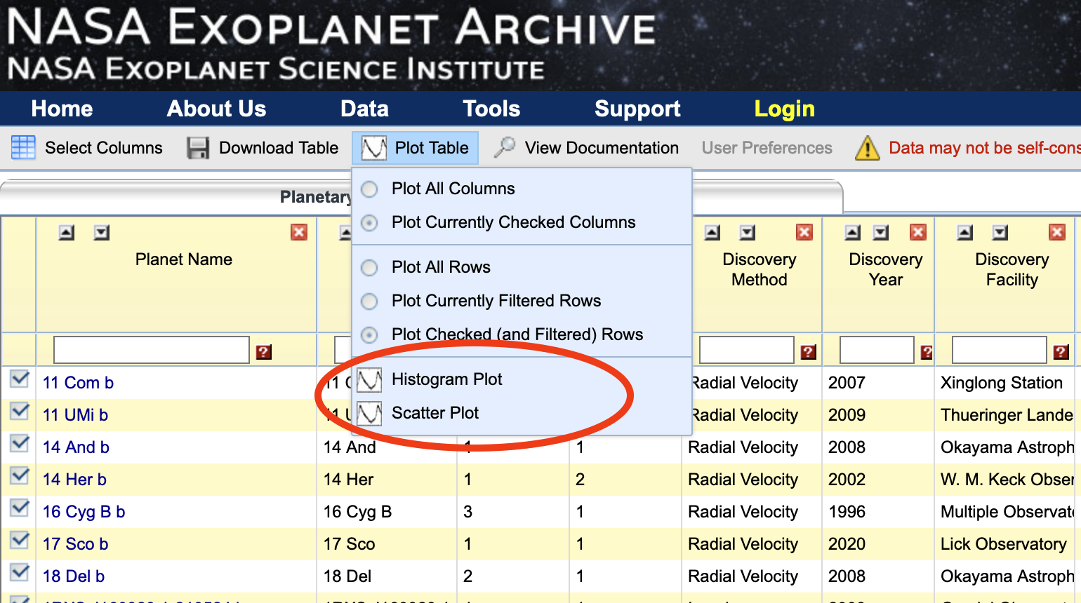
Before using the plotting tool through the interactive table, you must indicate which data from the table you want to send to the plotter. By default, all the currently checked columns and currently checked (and filtered) rows in the table will be exported. You can modify this set by selecting Plot All Columns and Plot All Rows, and/or Plot Currently Filtered Rows. The selected table data are then sent to the plotting widget when clicking either of the plot buttons; a new browser window will open and display the plot. NOTE: since additional filtering (other than automatic exclusion of objects missing data in any of the plotted parameters) is not currently possible in the widgets themselves, this would be the step where you pre-filter the data to be displayed in the interactive figures (e.g., for excluding outliers, etc.).
Using the Histogram Plot Widget
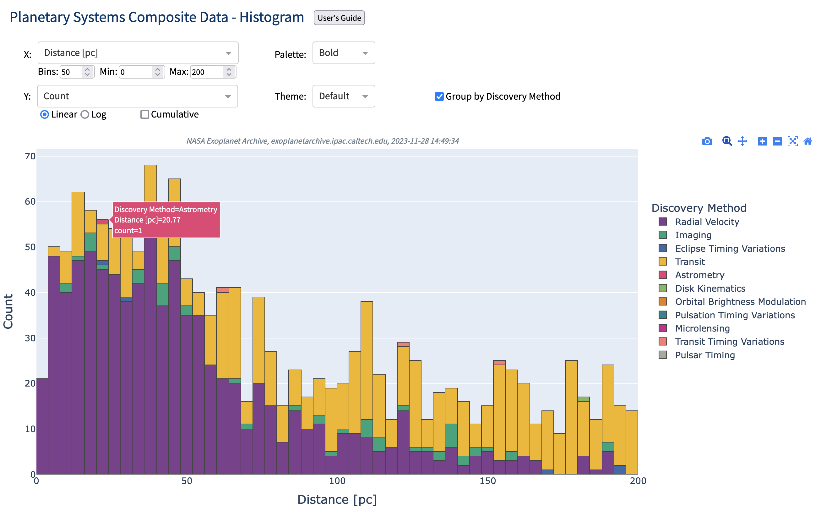
The initial histogram plot will show one of the default columns (Discovery Year, if included in the data selected from the table; if not, a fallback column will be used) on the x-axis, binned into 30 bins in the range from minimum to maximum value of the chosen x-axis parameter. X-axis data can be selected from the searchable X drop-down, and binning and min/max range can be changed in the Bins, Min, and Max fields by entering a value and confirming by pressing the Enter key. For the y-axis (Y) either linear or logarithmic display of Counts can be selected by clicking either the Linear or Log toggle. A cumulative histogram can be shown by checking the Cumulative box, and data can be grouped (stacked) by Discovery Method (if included) by checking the Group by Discovery Method box. Hiding or showing specific discovery methods can be done by clicking the relevant legend entry. Triple-clicking the legend will show/hide all items. In addition to these data display options, there are two plot configuration options—Palette and Theme—with various color maps and themes available as drop-down selections.
Hovering the mouse pointer over the bins in the histogram will display a label with associated data. Hovering anywhere in the plot will also display a menu in the upper right of the figure, allowing you to zoom, pan, reset axis, download plot as PNG, etc. (For more information about these plot interaction tools, see the Plotly modebar documentation.) Double-clicking anywhere in the plot will reset the plot axes.
Use Cases
The histogram plotting widget can be used to further investigate exoplanet properties for the ensemble of known exoplanets. Some possible use cases include:
- Plotting the number of discovered exoplanets per year since first discovery to current year
- Plotting the distance distribution of exoplanets
- Plotting the Gaia magnitude distribution of exoplanet host stars
- Plotting any of the above grouped by Discovery Method
For example, the following histogram plot shows the distance distribution of confirmed exoplanets within 200 pc, in 50 bins, grouped by Discovery Method:
Using the Scatter Plot Widget
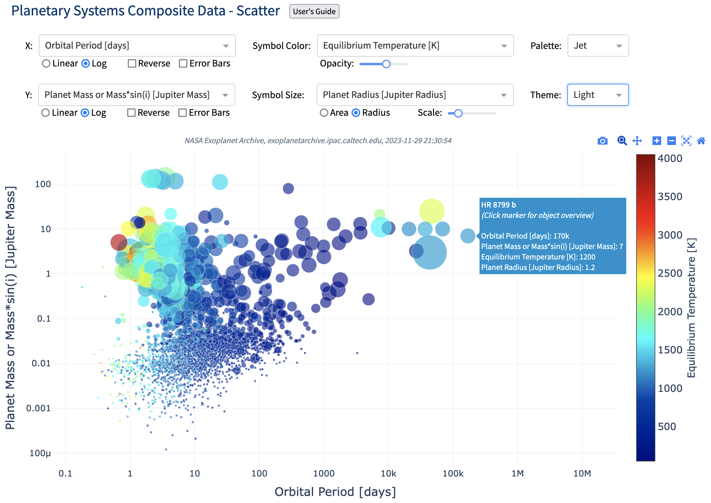
The initial scatter plot will show Orbital Period [days] vs Planet Mass or Mass*sin(i) [Jupiter Mass] on the x- and y-axis, respectively (with fallback to other defaults if those columns have been de-selected in the table before launching the widget).
As with the histogram plot widget, you can select which data to show on the axis from searchable drop-down lists (X and Y), and here there are also the options of setting axis scaling (linear or logarithmic, with Log being default), axis direction (Reverse toggle), or displaying associated error bars (Error Bars toggle). Additional data columns can be selected from drop-downs to control Symbol Color (with sub-setting slider for Opacity) and Symbol Size (with sub-setting for Area/Radius scaling with selected parameter, and additional scaling by some factor Scale). For categorical parameters, like Discovery Method, hiding or showing specific legend groups can be done by clicking the relevant legend entry. Triple-clicking the legend will show/hide all items. The same plot configuration options as for the histogram, Palette and Theme, are available, but with additional color palettes available for continuous parameters.
Hover labels show the associated data when hovering over any data point, and clicking on a data point marker will open the Exoplanet Archive Overview page for that object in a new browser tab. Hovering anywhere in the plot will also display a menu in the upper right of the figure, allowing you to zoom, pan, reset axis, download plot as PNG, etc. (Again, for more information about these plot interaction tools, see the Plotly modebar documentation.) Double-clicking anywhere in the plot will reset the plot axes.
Use Cases
The scatter plot widget can be used to further investigate exoplanet properties for the ensemble of known exoplanets. Some possible use cases include:
- Plotting the eccentricity-period diagram of known exoplanets
- Plotting the mass-period diagram
- Plotting the host star mass vs. planet period
- Plotting any of the above, with markers colored by Discovery Method
- Plotting any of the above, with markers colored by Equilibrium Temperature
- Plotting any of the above, with marker size set by Planet Radius
In the following example, the scatter plot shows the Planet Mass or Mass*sin(i) vs Orbital Period, with marker color set by planet Equilibrium Temperature (with opacity slider set to 0.6), marker size (radius) set by Planet Radius, using the Jet Palette and the Light Theme:
Last updated: 28 November 2023


![]()
![]()